Lovable vs v0 vs Bolt: which should you build with?
All three turn a sentence into a screen. The right one depends on what you need next: a product, a design, or an answer.
Tools · Oct 7, 2026 · 5 min read
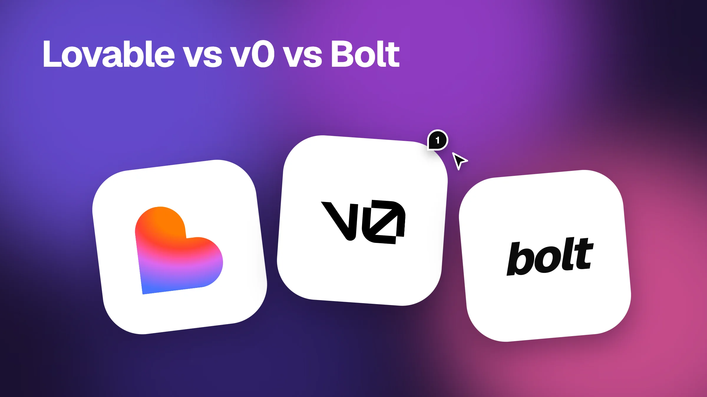
People ask us this more than anything else. Lovable, v0 and Bolt look alike in a demo. You type, an app appears. The difference shows up a day later, when you try to turn the demo into something real. Here is how we choose between them.
The short answer
| Lovable | v0 | Bolt | |
|---|---|---|---|
| Best at | Whole apps with data | Screens that look right | Fast full-stack experiments |
| You get | A working app with a backend | React and Tailwind UI code | A running project in the browser |
| Who it suits | Founders who don't code | Designers and front-end devs | Builders who like to tinker |
| First limit you hit | Changes get slow as the app grows | The backend is up to you | Large edits can break what worked |
Choose Lovable if you want a product
Lovable is the one to pick when the goal is a real app that people can sign in to. It builds the screens and connects a database behind them, so you get further without writing code than with the other two.
The trade-off comes later. Once the app is big, every change is a conversation, and small visual fixes can take a few tries. Good reviews matter most here, because the people building in Lovable are often the ones least able to dig into the code.
Choose v0 if the look matters most
v0 is made by Vercel and it is the quickest way we know to see a polished screen. Landing pages, dashboards and components come out clean, and the code drops into a Next.js project.
It is a front-end tool first. Sign-in, data and payments are yours to add. If you are a designer who wants to hand a developer something better than a mockup, v0 is hard to beat.
Choose Bolt if you want to try an idea tonight
Bolt runs a full project in your browser, front end and back end together. It is great for answering “could this work?” in an evening. You can see the code, change it yourself, and keep prompting.
The catch is stability. Ask for a big change and things that worked can stop working. Keep your requests small, and check the page after each one.
What all three have in common
Each one gives you a link to a live preview. And each one gets the big picture right and the details wrong. The heading is a bit too small. The button on mobile runs off the screen. The price says $8 in one place and $9 in another.
That is why we built Vizhound to work with all of them. Paste the preview link from Lovable, v0 or Bolt. Click on anything that is wrong and leave a note. Each note keeps the element, its styles and a screen grab. When you are done, copy one prompt and paste it back into the tool that built the app.
A simple way to decide
- Need users to sign in and save things? Start with Lovable.
- Need a screen that looks great, and you have a developer? Start with v0.
- Not sure the idea works at all? Try it in Bolt first.
- Still unsure? Build the same small screen in two of them. An hour will tell you more than any comparison.